
Why Does a Good Logo Matter More Than You Think?
Your logo is seen before anyone sees your tag line, before they compare prices, or click through your website. In a matter of seconds, they will determine if you appear credible, careful and memorable. A good logo does just that: makes a first impression your brand can build on.
However, many companies still use the logo as a piece of pretty wall art, and not for good reason. The opposite is effective logo designs. It’s a series of practical decisions on shape, colour, type and space, all with a view to helping people identify and trust you.
This design guide outlines 10 logo design rules and practical tips for logo design that set great logos apart from forgettable ones. It’s designed for business owners, marketers and those who want more visibility and smarter designs.
Key Takeaways
- A strong logo is easy to remember, easy to understand and tells who you are.
- It must work at every size, in colour and in black and white.
- Colour, type and originality should support your brand, not chase trends.
- Test the final design first, before committing.
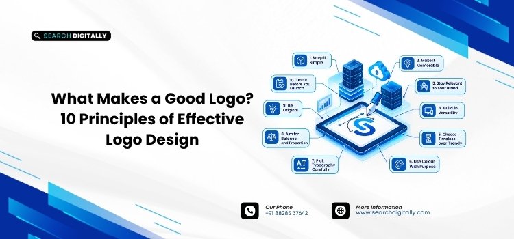
10 Logo Design Principles Behind Effective Logo Design
Designers disagree on exactly how many logo design principles exist, but the ten below appear again and again in logos that last.
1. Keep It Simple
Simple logos are easier to see, recall and reproduce. Apple and Nike show how one clean shape can carry a global brand. If you don’t know how to draw your Logo from memory in a few seconds, then it’s too detailed.
2. Make It Memorable
A memorable Logo uses one unique concept. FedEx is clever and puts an arrow between the E and the x that prompts a second look and sticks in the mind. Aim for a single clever detail, not five competing ones.
3. Stay Relevant to Your Brand
The design should suit your industry and audience. A law firm and a children’s toy shop need very different personalities. Relevance doesn’t have to be literal: a bakery logo can include the image of bread but it should be warm and welcoming.
4. Build in Versatility
Your logo will appear on a favicon, an invoice, a shop sign and a social profile. The design must be consistent in all of them. Prepare horizontal, stacked and icon-only versions so it fits every space.
5. Choose Timeless Over Trendy
Trends go out of style rapidly and a logo that follows one fades within a couple of years. Restrained colour and balanced type and classic shapes age so much better. A timeless mark can also be refreshed gently without losing recognition.
6. Use Colour With Purpose
Colour evokes emotions and recognition. Blue is the colour used for trust, green for growth and red for urgency. Limit your palette to two or three colours, and make sure the logo still works in black and white.
7. Pick Typography Carefully
Fonts speak before words do. A serif is more commanding, a rounded sans serif is more friendly. Do not use more than 2 typefaces, and be sure that your name is readable when small.
8. Aim for Balance and Proportion
The balanced logo appears stable and professional. The spacing, weight and alignment between symbol and text are more important than most people realize. A generous white space allows the design to breathe and remain clear.
9. Be Original
A logo consisting of stock icons or a “recolored” template is easily mistaken for another logo and is difficult to defend against others adopting it. Research your competitors first, so your design stands apart rather than blending in.
10. Test It Before You Launch
Preview the logo small and large, in greyscale, and on light and dark backgrounds. Share it with people who are not in your group and inquire what they remember. Honest feedback now costs far less than a rebrand later.
Logo Design Tips to Check Before You Finalise
Run through these logo design tips before approving any concept:
- Resize it to a favicon and be sure it remains recognizable.
- View it in one colour on both light and dark backgrounds.
- Ask five people to describe it a day later.
- Compare it with competitors to avoid accidental similarity.
Why Professional Logo Design Supports Brand Logo Design?
Your Logo is the most visible aspect of your identity, but not the only aspect. Clear positioning, voice and values are the foundations of strong brand logo design, so our guide to building a brand identity that lasts makes for a useful companion.
If you prefer to let the experts do the work, professional logo design will save on time and expensive changes. Our checklist on how to choose the best logo design company explains what to look for.
Conclusion
A good logo is not just by chance and taste. It is simple, memorable, relevant, versatile, timeless, well coloured, well typeset, balanced, original and tested. By using these logo design principles, your brand logo design will be a reliable tool to use in all of your marketing efforts, instead of a piece of the corner of your website.
FAQs
Q1. What are the most important principles of effective logo design?
Keeping it simple, memorable, relevant and versatile is key. A logo that is easily identifiable, appropriate to your industry and can be displayed in any size will benefit your brand for many years to come.
Q2. How many colours should a good logo use?
Typically, two or three colors will suffice. A limited palette ensures a clean design, lowers printing costs and makes the logo easily adaptable to black and white.
Q3. Can a small business create a good logo without a designer?
Yes, provided that you have a clear brief and you follow the principles above. But, with the help of professional Logo Design, your logo will include research, originality and polished files which will come in handy when your logo needs to be used on the web, in print and in packaging.
Talk to the Search Digitally team about logo design, branding and digital marketing.
Contact us: searchdigitally.com/contact | Email: support@searchdigitally.com